Illustration
|

|
|
Inspiration
Harry Clarke was an Irish stained-glass artist and book illustrator. Born in Dublin, he was a leading figure in the Irish Arts and Crafts Movement. His work was influenced by both the Art Nouveau and Art Deco movements. His stained glass was particularly informed by the French Symbolist movement. Clarke produced more than 130 windows, he and his brother Walter having taken over his father's studio after his death in 1921. His glass is distinguished by the finesse of its drawing and his use of rich colors, and an innovative integration of the window leading as part of the overall design, originally inspired by an early visit to see the stained glass of the Cathedral of Chartres. He was especially fond of deep blues. Clarke's use of heavy lines in his black-and-white book illustrations echoes his glass techniques. Clarke's stained glass work includes many religious windows, but also much secular stained glass. Clarke used deep rich colors in his stain glass with detailed elongated figures to create a magical piece. This piece I was inspired by St. Patrick Preaching to his Disciples to show how the different saints have impacted different Catholic stoires. |

|
|
Planning
I started off by looking through different Harry Clarke stain glass pieces to find one that I wanted to recreate. My first idea was to just use colored pencil and change the medium of the piece and have it be exactly the same, but after looking at a few of them I thought it would be an interesting idea to modernize one of his pieces. I chose the the stain glass of St. Patrick Preaching to his Disciples. This piece spoke to me because the center point was St. Patrick. This saint has always been apart of my life because being an Irish dancer for so long we hear story's all about him, also my grandmother who is a Irish Catholic decorate her house with little St. Patricks and told me and my sister stories about him when we were little. After doing research on the piece I realized that St. Rosa de Lima was also in the stain glass. This made me officially sure I was going to recreate this piece because that was my saint I used when I was confirmed in the Catholic Church. I started out my getting my illustration board to the size I wanted it to be because I wanted the stain glass to keep shape. I then started by planning out how I would mix Sharpie with colored pencil. |

|
|
Process
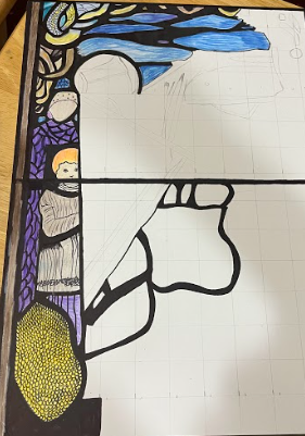
I started the project by adding a 1x1 inch grid to my board and sketching out the lines of different shapes and figures I would later fill in. I then went in and added black sharpie to the lines I needed to fill in as the paneling for the windows. I didn’t fill them all the wasy because it was hard to get perfect lines so I wanted to wait for the final touches to finish those lines. I then started at the top left corner and filling it in with the colored pencil. A technique I found right away that worked beautiully was coloring with the main color then going over it with a white colored pencil to really get in all the creases and blend the colors nicely. I would then go over to draken areas or add the black sharpie details. |

|

|
I then started with the blue part up on the top. This is when I found the blending with the white technique helpful because I used different colors of blue to create This was one of my favorite parts to work on because it was so simple but it gave the piece so much details. I also started to work down the piece by adding the little shapes up at the corner. Some of these had different black lines creating movement throughout the piece. I also started the outline of the lady and young boy. This was easy because I just needed to outline them with black and then add purple shading. I also added the outlines of the main St. Patrick for when I would go back in and add colors.
|
|
I then finished the people on the left side which was surprisingly easy. When I first started I thought it was going to be hard but when I was working on it, it turned out to be one of the easier parts. I colored in the different parts and adding the balck line ontop of what the young boy was wearing to give the extra detail and make it look like clothes and not just a shape. I then finished the purple next to the young boy by adding different lines to create different shapes. I then also added the yellow shape with the little circle at the bottom. It was hard to keep all the little circles the same shape. I also started to add the black lines throughout to block out the colors.
|
|
I then started to add the different colors throughout the piece after the black outlines were added. I would blend different colors together with the white to make them look melted like how the stain glass was. I also started on the St. Patrick and coloring him in. I needed to make the greens different from each other to show the contrast in lighting. I added the little black lines on the clothing to give the details of how its more than a shape. I also started to work on the other faces praying to St. Patrick. For this I just drew black thin lines for the faces and colored them in with a light pale skin tone color. Out of the whole project this was one of the hardest part because I needed to make sure the faces look correct. I then started to finish all the little details up at the top that were just shapes. The overall hardest part of the project was getting the lines to match up and make the project look correct. That was what took the longest. I also liked using the Sharpie because it could cover any line that was not the straightest.
|

|
|
|
|
Reflection
Overall I am happy with how this project turned out. This is my second time using colored pencils for a project on an illustration board and can say that this is one of my favorite mediums to work with. I feel like the piece really captured the attention of the viewer the bright colors that were inspired by Harry Clarke St. Patrick Preaching to his Disciples. This piece really expresses the theme self expression because of the family connection around the different saints and how I learned from them. This project was one of my favorites to work on because it was a different style that I never worked with before. I also liked how I had an idea before going into the project and executing it.
Compare and Contrast
Similarities
Overall I am happy with how the project turned out. This is my second time working on a project with colored pencil. If I were to change different aspects of the piece I think it would be the medium I used. I think if I used water colored it would act more like a stain glass to help mimic that technique. I think that using water colored would make the piece look brighter with the colors but the different colors would blend better making it look like the glass was melted together. Another thing I would change would the thinning the black line used to separate the different colors and shape in the illustration. I also would have done the faces on the different saints differently. At first they were turning out good but then towards the end they weren’t as good as I was hoping.
ACT Questions
Clearly explain how you are able to identify the cause-effect relationship between your inspiration and its effect on your artwork?
The cause and effect relationship between the different pieces of artwork is that Harry Clarke used different techniques that I tried to use in my project as well.
What is the overall approach the author has regarding the topic of your inspiration?
To show the different saints in the Catholic Church and their different stories.
What kind of generalizations and conclusions have you discovered about people, ideas, culture, etc. while you researched your inspiration?
I have come to the conclusion that most people believe in different saints and their stories get passed around family generations.
What is the central idea or theme around your inspirational research?
The overall theme around my project was self-expression. I wanted to show that even though you lose someone they will always be with you.
What kind of inferences did you make while reading your research?
The inferences made were that Harry Clarke were that saint help people in life
Bibliography
https://www.wikiart.org/en/harry-clarke
https://www.harryclarke.net/
Overall I am happy with how this project turned out. This is my second time using colored pencils for a project on an illustration board and can say that this is one of my favorite mediums to work with. I feel like the piece really captured the attention of the viewer the bright colors that were inspired by Harry Clarke St. Patrick Preaching to his Disciples. This piece really expresses the theme self expression because of the family connection around the different saints and how I learned from them. This project was one of my favorites to work on because it was a different style that I never worked with before. I also liked how I had an idea before going into the project and executing it.
Compare and Contrast
Similarities
- A similarity was the colors used in both pieces. I wanted to use the deep rich colors that were similar to Harry Clarke in my piece.
- Another similarity was the dark black lines that I used to block out the different colors, which is similar to the lines Clarke used in his stain glass.
- One of the differences was the medium used. In mine I used colored pencil and sharpie markers whereas Clarke used real stain glass.
- Another difference was that I modernized it. When i think of modernization there is solid colors which I tried to use whereas in the stain glass there was little line details.
Overall I am happy with how the project turned out. This is my second time working on a project with colored pencil. If I were to change different aspects of the piece I think it would be the medium I used. I think if I used water colored it would act more like a stain glass to help mimic that technique. I think that using water colored would make the piece look brighter with the colors but the different colors would blend better making it look like the glass was melted together. Another thing I would change would the thinning the black line used to separate the different colors and shape in the illustration. I also would have done the faces on the different saints differently. At first they were turning out good but then towards the end they weren’t as good as I was hoping.
ACT Questions
Clearly explain how you are able to identify the cause-effect relationship between your inspiration and its effect on your artwork?
The cause and effect relationship between the different pieces of artwork is that Harry Clarke used different techniques that I tried to use in my project as well.
What is the overall approach the author has regarding the topic of your inspiration?
To show the different saints in the Catholic Church and their different stories.
What kind of generalizations and conclusions have you discovered about people, ideas, culture, etc. while you researched your inspiration?
I have come to the conclusion that most people believe in different saints and their stories get passed around family generations.
What is the central idea or theme around your inspirational research?
The overall theme around my project was self-expression. I wanted to show that even though you lose someone they will always be with you.
What kind of inferences did you make while reading your research?
The inferences made were that Harry Clarke were that saint help people in life
Bibliography
https://www.wikiart.org/en/harry-clarke
https://www.harryclarke.net/
