Block Print
|
|
Exhibition Text
This Block Print was inspired on how climate change is affecting our animals. Margaret Taylor Burroughs piece “On the Beach” inspired the technique used for this piece. Zaria Forman’s piece “Arctic Ocean” inspired how climate change can be showed through art. Using a linoleum block and different carving tools I used different techniques to create a meaningful piece. This block print used contrast for a hopeful mood in bring attention to climate change.
This Block Print was inspired on how climate change is affecting our animals. Margaret Taylor Burroughs piece “On the Beach” inspired the technique used for this piece. Zaria Forman’s piece “Arctic Ocean” inspired how climate change can be showed through art. Using a linoleum block and different carving tools I used different techniques to create a meaningful piece. This block print used contrast for a hopeful mood in bring attention to climate change.

Inspiration
For My Block Print I was inspired by Margaret Taylor Burroughs. She used her Block Prints to bring awareness to peoples in her culture. Her prints made the statement that people with different skin colors were not treated equally. I was inspired by the piece "On the Beach". The line details that she used helps create a sense of form. The different shapes and patterns she uses helps this look almost realistic.
For My Block Print I was inspired by Margaret Taylor Burroughs. She used her Block Prints to bring awareness to peoples in her culture. Her prints made the statement that people with different skin colors were not treated equally. I was inspired by the piece "On the Beach". The line details that she used helps create a sense of form. The different shapes and patterns she uses helps this look almost realistic.

Another artist that I was inspired by was Zaria Forman. She is an artist who uses their art to show climate change. Climate change is what I am basing my theme off of. I think that climate change is a huge problem is our society and that out attention needs to be brought to it. Her piece “Arctic Ocean” is a pastel drawing on paper that depicts an aerial view of summer sea ice off the northwest coast of Ellesmere Island, Canada. Forman stated that she wanted to convey the beauty of these vulnerable landscapes, as opposed to their devastation, to inspire viewers to help protect and preserve them.
Planning
When I first started planning what I wanted to do for this piece I knew that I wanted it to be about climate change. I had the idea of polar bears showing them on snow that was melting. I got this idea when I was looking up climate change block prints. After this I started to draw out possible ideas. This is where I really thought where I was going to put the shadows to create contrast.
When I first started planning what I wanted to do for this piece I knew that I wanted it to be about climate change. I had the idea of polar bears showing them on snow that was melting. I got this idea when I was looking up climate change block prints. After this I started to draw out possible ideas. This is where I really thought where I was going to put the shadows to create contrast.

|

|

|
Process
After a few sketching in my sketch book I decided to start drawing on my linoleum plate. I tried to get to look as close as it could to the ones that I sketched out (the middle picture). After I was done with that I started carving the plate. Using the carving tools(first picture on the bottom) I carved out everything I wanted to keep white and not have the ink get on it. This is when I found out that all the little details was going to be a harder to achieve and that my lines were not going to be prefect. When I was done carving (last picture on the bottom) I started the ink process. Using the plastic palette knife, I stirred and scooped the black water-based block printing ink onto the printing tray that I set on top of a newsprint paper. I only put a couple smaller scoops onto the tray, then using the knife I smeared the ink on the tray so it would be easier to get ink on the brayer. I started to roll the brayer in the ink around the printing tray. Once I got enough ink on the brayer I started rolling the brayer on the linoleum plate. I tried to get it as even as possible, while not putting to much ink on the piece but putting enough where is doesn’t look uneven. After I thought there was enough ink on the plate I placed my drawing paper on top of the piece. I used a bamboo printmaking baren so it could rub the ink onto the paper. Once I thought that the ink would be even on the paper I removed the paper from the linoleum. I repeated this process many times until I was satisfied with the outcomes.
After a few sketching in my sketch book I decided to start drawing on my linoleum plate. I tried to get to look as close as it could to the ones that I sketched out (the middle picture). After I was done with that I started carving the plate. Using the carving tools(first picture on the bottom) I carved out everything I wanted to keep white and not have the ink get on it. This is when I found out that all the little details was going to be a harder to achieve and that my lines were not going to be prefect. When I was done carving (last picture on the bottom) I started the ink process. Using the plastic palette knife, I stirred and scooped the black water-based block printing ink onto the printing tray that I set on top of a newsprint paper. I only put a couple smaller scoops onto the tray, then using the knife I smeared the ink on the tray so it would be easier to get ink on the brayer. I started to roll the brayer in the ink around the printing tray. Once I got enough ink on the brayer I started rolling the brayer on the linoleum plate. I tried to get it as even as possible, while not putting to much ink on the piece but putting enough where is doesn’t look uneven. After I thought there was enough ink on the plate I placed my drawing paper on top of the piece. I used a bamboo printmaking baren so it could rub the ink onto the paper. Once I thought that the ink would be even on the paper I removed the paper from the linoleum. I repeated this process many times until I was satisfied with the outcomes.

|

|

|
Experimentation
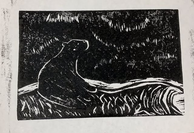
This was one of my first prints that came out. The ink was not even in the sky. I liked the detail looked on the polar bear so I decided I didn’t need to add more. Overall I thought that it was good for being one of my first ones.
This was one of my first prints that came out. The ink was not even in the sky. I liked the detail looked on the polar bear so I decided I didn’t need to add more. Overall I thought that it was good for being one of my first ones.
This one I tried to but more pressure on while rubbing the baren to the paper, which I think I achieved because the ink looks darker. I think that I didn’t get enough ink on the plate because the sky did not have an even coat of ink on it.
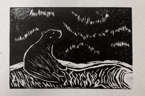
Before I laid the ink down I washed my plate because I thought it would help clean out the little lines that ink got in. Overall I think this one was my favorite piece. I like the way the details add to the piece and how the darkest where the ink was placed contrasts with the where the plate was carved.

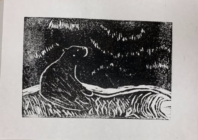
I repeated the process many times to try to recreate my third picture but none of them would turn out right. They were either spotty or there was to much ink were they lost all the detail. As seen in this picture the ink was not rolled on even and very spotty all throughout the piece.
I repeated the process many times to try to recreate my third picture but none of them would turn out right. They were either spotty or there was to much ink were they lost all the detail. As seen in this picture the ink was not rolled on even and very spotty all throughout the piece.
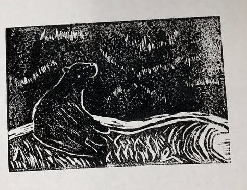
The had to be my second favorite piece that came out. After all the prints that didn’t turn out I wash my plate to try to get a fresh start. This one you can tell that the pressure amount was good because the ink applied nicely. The on;y thing that didn’t make it my top piece is that the polar bears feet lost a little detail.

I tried to get three prints that I really liked, but none of them turned out the way I wanted them too. I repeated this process until I had enough prints and just kept the two prints that turned out the way I wanted them too. This print was decent, I just think that it would have been done better.
Reflection
Compare and Contrast
Similarities
Critique
Overall I like the way my plate turned out. If I needed to redo my piece I would fix the bottom right corner. I carved that piece out to give the snow texture and detail but after I started carving I realized that it was a lot harder than I thought. The carving tools wouldn’t get the details I wanted so I changed plans. I just started to carve random lines in the snow to create the movement. I was surprised how much I liked the detail on the polar bear. I tried to make it look like fur. Another thing that I also liked was the sky and how the lines added to the piece. I would like to try to block print again in the future.
Compare and Contrast
Similarities
- Both used black and white to create contrast for the piece
- Used small little lines for create texture, Margaret Taylor Burroughs in the sky, my prints in the snow
- Margaret Taylor Burroughs lines’s look like they are a pattern when mine are just random
- I used an animal for mine piece and Margaret Taylor Burroughs used humans for her print
Critique
Overall I like the way my plate turned out. If I needed to redo my piece I would fix the bottom right corner. I carved that piece out to give the snow texture and detail but after I started carving I realized that it was a lot harder than I thought. The carving tools wouldn’t get the details I wanted so I changed plans. I just started to carve random lines in the snow to create the movement. I was surprised how much I liked the detail on the polar bear. I tried to make it look like fur. Another thing that I also liked was the sky and how the lines added to the piece. I would like to try to block print again in the future.
ACT Questions
Clearly explain how you are able to identify the cause effect relationship between your inspiration and its effect on your artwork?
There is natural contrast between values in block prints but, I used the artist Margaret Taylor Burroughs for more inspiration. I liked the way they she used different geometric shapes in her piece to create movement and add detail.
What is the overall approach the author has regarding the topic of your inspiration?
When I went to find websites for inspiration to learn more about the artist most of them came up trying to sell me pieces. The other website I used gave me lots of information about different climate change artists. Once I found a piece I liked about climate change I started to research that artist.
What kind of generalizations and conclusions have you discovered about people, ideas, culture, etc. while you researched your inspiration?
Before researching I knew how much climate change was affecting us and everything around us but, after looking for different artist and reading about them I didn’t realized how much the world has changed over the years from this.
What is the central idea or theme around your inspirational research?.
The central theme that inspired my piece was Climate Change. I knew I wanted to do something that had to do with Climate Change so I picked artists and different art pieces that I thought would help tie my theme together.
What kind of inferences did you make while reading your research?
An inference I made was that different artists use their platform to bring up problems in society like how Zaria Forman used her art to bring awareness to climate change.
Bibliography
Lescaze, Z. (2018, August 22). 12 Artists On: Climate Change. The New York Times. https://www.nytimes.com/2018/08/22/t-magazine/climate-change-art.html
Margaret Burroughs :: (2021). The Johnson Collection, LLC. https://thejohnsoncollection.org/margaret-burroughs/
Biography. (2021). Margaret Burroughs. http://www.margaretburroughs.com/biography/
Critique Comments
My work was satisfactory in quality, I just think that I can add more details in certain spots. I also used the elements/principles command terms. I showed details on how I developed my ideas. I feel like if I change and add a few thing that It could be brought up to an advanced.
I understood the symbols and meaning behind what I created. The work is detailed showing my theme. I used the medium correctly and had the ability to get my theme across. I tried to use different techniques to create a very high quality.
My work was highly effective in showing my theme. My work also shows complicated designs to get my theme across.
My work was satisfactory in quality, I tried to show details some were just underdeveloped. I feel like my reflection was good but I would probably add to it once I add to my process.
