|
Self Portrait
Size: 3ft x 3ft Medium: oil paints Completion May 2022 Exhibition Text
My self portrait explores the idea of expression using different stereotypes most young girls are given. Using the Portrait of Irène Cahen d'Anvers by Renoir and replacing the young girl with myself, I tired to embody what the perfect young girl would look like. This was achieved through oil paints and in the Impressionist style. |

|

Portrait of Irène Cahen d'Anvers by Renoir 1880
|
Inspiration
Portrait of Irène Cahen d'Anvers by Renoir was commissioned by the wealthy French Jewish banker Louis Cahen d'Anvers in 1880. In 1874 Renoir had lost a ten year friendship with Jules Le Cœur. He not only lost the support he gained from this friendship but also the ability to stay on their property near Fontainebleau and its scenic forest. This caused Renoir to change his subjects that he painted to due him losing his favorite painting spot. In the Portrait of Irène Cahen d'Anvers the little girl is named Irène Cahen d'Anvers at the age of 8. The Portrait of Irène Cahen d'Anvers, also commonly called Little Irene, is considered today as one of Renoir's masterpieces. Once the painting was finished Louis Cahen d'Anvers the father of Irène Cahen d'Anvers was unhappy with the painting and hung it in the servants quarters. During World War II, the painting was stolen by the Nazis during their organized looting of European countries. In 1946 it resurfaced and was exhibited in Paris as one of the "French masterpieces found in Germany". |
The Portrait of Irène Cahen d'Anvers by Renoir came to be one of the most famous example of child portraiture. For this style of art they combined elegant clothes and done up hairstyles with the look of an innocent expression of childhood. Although it was children they were painting the influence from adolescent portraits had an effect on this style. Most adolescent portraits show a serious flawless subject influencing this to be the same with child portraits. Here the precision on her face with the porcelain features can remind one of a porcelain doll.
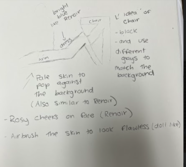
The colors used in the portrait can show the porcelain like features Irène Cahen d'Anvers was given. With her cheeks rosy in a airbrushed way to contrast against the bright pale. The light blue shows an elegance given to the young girl. The dark background also helps her bright red hair pop.
The colors used in the portrait can show the porcelain like features Irène Cahen d'Anvers was given. With her cheeks rosy in a airbrushed way to contrast against the bright pale. The light blue shows an elegance given to the young girl. The dark background also helps her bright red hair pop.
Planning
I chose this painting because the goal Renoir had was to make her into a porcelain doll. This is when I thought of the stereotype of young girls have to be shaped into perfect little girls and fit all these stereotypes while growing up. For as long as I can remember I used to compare myself to dolls that I had, wanting to one day look like them. I used this painting to turn myself into a doll look-a-like that so many young girls wish to achieve. I knew that to get the best look-a-like painting I would need to find a blue dress similar to the one the young girl is wearing. Along with this I knew I needed to also find a bright blue bow around my house. I had found a old Alice and Wonderland Halloween costume for my dress and a random blue bow I had once used for dance. After getting all my props I started to sketch out how I wanted the painting to look. I knew I wanted the same pose as the girl, but if I didn’t get it exactly that would be fine. I took my reference picture in my bathroom just for the lighting. I threw a blanket over the shower to get a plain background. After taking different pictures to get the correct pose and wear I wanted my eyes I finally got the perfect picture.
I chose this painting because the goal Renoir had was to make her into a porcelain doll. This is when I thought of the stereotype of young girls have to be shaped into perfect little girls and fit all these stereotypes while growing up. For as long as I can remember I used to compare myself to dolls that I had, wanting to one day look like them. I used this painting to turn myself into a doll look-a-like that so many young girls wish to achieve. I knew that to get the best look-a-like painting I would need to find a blue dress similar to the one the young girl is wearing. Along with this I knew I needed to also find a bright blue bow around my house. I had found a old Alice and Wonderland Halloween costume for my dress and a random blue bow I had once used for dance. After getting all my props I started to sketch out how I wanted the painting to look. I knew I wanted the same pose as the girl, but if I didn’t get it exactly that would be fine. I took my reference picture in my bathroom just for the lighting. I threw a blanket over the shower to get a plain background. After taking different pictures to get the correct pose and wear I wanted my eyes I finally got the perfect picture.

|
|

|
|
Process
To start the process I started by adding a wash to the canvas just to make sure there was no white that could be seen. Once that dried I added my 1x1 inch grid onto the canvas to make it easier to sketch what I was going to paint. I then started by sketching out myself onto the canvas. I did this by using a app called grid maker to line everything up perfectly. Once I got everything in the correct place I started with the gray background. I mixed up white and black to get the correct gray that would match the blanket that was thrown over the shower. I made sure to line it up perfectly with my body just to make sure that no white was showing. I then decided to add the black for the chair. At the time I thought this was a good idea but with blending other thing around it, it just kept messing up so I had to redo the chair so many times. |

|

|
The next thing I did was the arms. The hardest part was finding the correct skin tine color and layering it up to make sure that the grid couldn’t be seen under it. I first painted my front arm and just was done for the night, but when I came back to it the next day the color had oxide so it wasn’t the correct color anymore. After creating more colors I finally found one that worked at stayed the same color when it oxide. I then used different shades of light brown to give my arm the shadows and also adding my elbow. I then did the other arm which had a red undertone because of the way the light hit it. I used the same pale color and just added a little red into it. I then decided to work on the blue dress under my elbow because I needed to blend the shadows. This part was pretty easy, just finding the correct blue was once again a challenge. I added a darker blue on top to give it the fabric look. After finishing this the chair that I had previous painted had been blended over so I needed to redo it. I also added the shadows that the chair casted against the blanket used for the background.
|
|
I then started to map out where my hair needed to go because I didn’t want the blue or white under my hair unless it was suppose to. I then started on the white part of my dress. This was hard best the white was so sheer that I just kept adding layers. It also didn’t help that I was using oil paints making the paint stay wet for weeks on end. At this stage I also fix my arms and added any little details I forgot or added more shading. This seemed to help because the grid you can barely see under it. I also added the white part to my sleeve that was on my dress. At this point I didn’t know what I wanted to work on next so I just worked on the shower curtain in the top right corner. I thought this could be a hard part with the different colors and shapes I needed to create but it ended up only taking me 5 minutes. I was really happy with how it turned out, along with how fast it took.
|

|

|
Once I got the white part of my dress dark enough where you couldn’t see the grid I started by adding the shadows in the correct places. This was a pretty easy part, i just took a light gray and added it where the fabric folded I then took light and paint thinner to blend it and make it look realistic. I also added the lace that was on my dress. This was easy only because you had to zone in the see the lace properly so I just really only needed to shade the area with a light gray. This is the part where I added a light brown to the area I wanted my hair to go. I had blonde hair but in the light underneath it looks like a dark blonde or a really light brown. I did this so later I could go back and add the highlight for the light browns and blonde to make it look lime hair.
|
|
When I came back to the hair it had oxide into a darker brown that I had hoped. I had just left it for ow I wasn’t going to worry about it until I was about to start with my hair. I then decided it was time to start my face. I had created a pale skin tone color, even lighter than my arms to give the porcelain doll look that Renoir was also trying to achieve. At first it was to light where I looked sick so I layer it with the color I had used for my arms which created the exact color I was looking for. I started by creating the shadows on the neck and chin. I took a brownish-gray to add my jawline and blend that down my neck to add the shadows my head created in the light. This was very similar to how Renoir painted the neck in his painting. Using the same color I added it to my cheek bone and contouring my face. This color was also used where the shadow of my nose was casted along with the outline of my nose. I took the rosy blush color and added to to my cheeks and nose. I wanted this color to pop because it really gave the porcelain doll look I was inspired by. I think the hardest part was my eyes, because the oil paint would not dry the paint kept spreading making it look messy. After redoing it I decided to start the other one and left the eye on the left alone until I was almost done with the painting. The eye on the right was a lot easier, I took a light brown added my eye shadow and the other creases around my eye. I then added my waterline along with my lashes before adding my pupil. Once I got the eye to look how I wanted I added the eyebrows with the same color I used for my hair but I did lighten it. This is where I added the blue bow to my hair using the same colors as I did from my dress.
|

|

|
This was the part where I actually added my hair. I took a pale color that could be a skin-tone color and added it over the brown that was already there. I did it in small sections and the took a light brown and added little line to make it look like hair. I also did it because Renoir used flowy lines for the hair and I wanted it to look similar to Renoir. Once i finished the hair that was already placed down I added the hair that layed across the dress where you could see the white or blue underneath it. I used the same technique, and overall I think my hair is my favorite part of the painting. I also added my necklace with a gold color, but it can’t really be since. I also had to add all the little folds in the blanket in the background. I did this by adding black lines then taking gray and blending over it. I didn’t actually think it would work, but it did.
|
|
|
|
Reflection
Compare and Contrast
Similarities
Critique
Overall I am really happy with how my self portrait turned out. I think it looks very similar to my inspiration which was the goal. I wanted to capture the idea that young girls have so many stereotypes that they have to face at such a young age. Looking at these battles that these girls have to face about needed to be the prefect gril really got me thinking on how society has formed us into thinking that we have to be doll like. I think I painted my hair really well. I gave it that Impressionist look by using small brush strokes and adding different colors. I think I got the correct color of blonde even with my highlights. I also liked the way the blue bow popped against my hair. Another part which I thought could be hard was the background but it actually was pretty easy. I think my favorite part was the way the shower curtain blended together to look real. A part that I didn’t like was the eye on the left, it just didn’t look correct, but at the same time in my reference picture it looks like a shape with colors and not so much an eye. Another part I didn’t like was the shadows on my face because they made me look gray while trying to take the pictures.
Compare and Contrast
Similarities
- The color was similar to Renoir. I had mad sure to use colors for my face to look like a porcelain doll. I also used rosy colors in my cheeks which contrasted against the bright pale colors. Also the bright blue bow in my hair was very similar to the blue bow the young girl had in the “Portrait of Irène Cahen d'Anvers”.
- The pose I was in was very similar to the “Portrait of Irène Cahen d'Anvers”. Both of us are sitting in a chair facing the left side of the canvas. We both had our hair flowy in certain ways. I feel like if you were to look at more and the Renoir you could definitely tell that i was inspired by him.
- One of the differences was the contrast between the background my my body. In the “Portrait of Irène Cahen d'Anvers” the background is darker making the face pop more, where in my it still pops just not as much.
- Another difference was the angle my camera was to take the reference picture. I did it from a lower angle where Renoir painted the “Portrait of Irène Cahen d'Anvers” at a much higher angle. I think the angle really depends what shadows I needed to add along with what i needed to paint overall.
Critique
Overall I am really happy with how my self portrait turned out. I think it looks very similar to my inspiration which was the goal. I wanted to capture the idea that young girls have so many stereotypes that they have to face at such a young age. Looking at these battles that these girls have to face about needed to be the prefect gril really got me thinking on how society has formed us into thinking that we have to be doll like. I think I painted my hair really well. I gave it that Impressionist look by using small brush strokes and adding different colors. I think I got the correct color of blonde even with my highlights. I also liked the way the blue bow popped against my hair. Another part which I thought could be hard was the background but it actually was pretty easy. I think my favorite part was the way the shower curtain blended together to look real. A part that I didn’t like was the eye on the left, it just didn’t look correct, but at the same time in my reference picture it looks like a shape with colors and not so much an eye. Another part I didn’t like was the shadows on my face because they made me look gray while trying to take the pictures.
ACT Questions
Clearly explain how you are able to identify the cause-effect relationship between your inspiration and its effect on your artwork?
The cause and effect relationship between my art and my inspiration is that I had place myself into the artist piece and using the same style of painting that my inspiration did.
What is the overall approach the author has regarding the topic of your inspiration?
The approach was just painting child portraiture, in a way people would like in the Impressionist style.
What kind of generalizations and conclusions have you discovered about people, ideas, culture, etc. while you researched your inspiration?
While doing my research I realized that child portraiture was a form of adult portraiture and how they wanted the kids to look like a adults, which is very simillar to nowadays where there is always some new trend that young girls feel they have to do.
What is the central idea or theme around your inspirational research?.
My overall theme was the stereotype that young girls have to be shaped into perfect little girls and fit all these stereotypes while growing up.
What kind of inferences did you make while reading your research?
How there are many young girls in the world that feel like they have to fit into some stereotype.
Bibliography
Pierre-Auguste Renoir | Biography, Art, & Facts. (2022). Encyclopedia Britannica. https://www.britannica.com/biography/Pierre-Auguste-Renoir
Pierre-Auguste Renoir. (2022). Google Arts & Culture. https://artsandculture.google.com/entity/pierre-auguste-renoir/m06466?hl=en
Pierre Auguste Renoir - The Complete Works - pierre-auguste-renoir.org. (2022). Pierre Auguste Renoir. https://www.pierre-auguste-renoir.org/
